On this day, August 22, 2002, President George W. Bush proposed to end the government's "hands-off" policy in national forests and ease logging restrictions in fire-prone areas.
Also on this day, August 22, 2014, the State of Oregon filed a $200 million suit against Oracle Corp. and several executives over the company's role in creating the troubled website for the state's online health insurance exchange.
Also on this day, August 22, 2020, demonstrators faced off in Portland with the two sides -- one aligned with a "Back the Blue" rally and the other a Black Lives Matter counter-demonstration -- reportedly largely ignoring police warnings. Ultimately, Department of Homeland Security officers deemed the gatherings unlawful and moved through the plaza, forcing the crowd to disperse.
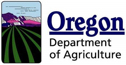
$54,000 price tag for new logo, brand
The Oregon Department of Agriculture (ODA) is proud to announce a new look for the department. The new brand is the result of a redesign effort intended to mirror the growth and transformation of ODA. The previous logo, created more than 30 years ago, is not representative of the many services ODA provides nor does it reflect the department’s
updated strategic plan, mission, and vision.
The new logo, colors, and tagline represent agriculture throughout the state of Oregon and ODA’s commitment to the industry. The raising yellow sun represents the vast livestock lands in eastern Oregon, fields of wheat, and optimism as we move into the future. The green leaves illustrate Oregon’s fertile valleys, diversity of crops, growth, and renewal. And blue is tied to a continuous cycle of transformation, Oregon’s oceans, rivers, rain, and commercial fishing. The elements form an “O†for Oregon symbolizing wholeness and timelessness. The tagline reinforces ODA’s dedication to protecting, promoting, and working to help Oregon agriculture, businesses, and communities prosper—today and tomorrow.

ODA began the process of updating its brand in the fall of 2019. The previous logo was nearly 30 years old. The department is thankful for the time stakeholders and employees dedicated to helping create the new brand which represents all of ODA’s work. While the work was completed in March 2020, the release was delayed due to the COVID-19 pandemic.
In recognition of the state’s budget constraints, ODA is focused first on updating its digital presence with minimal or no cost. The department will wait to order new letterhead, business cards, and other collateral until we run out of the old. As a result, the public may see a bit of the old logo along with the new for some time as the department makes this transition.
--Ben Fisher| Post Date: 2020-08-21 14:15:57 | Last Update: 2020-08-21 14:25:16 |


