“We are so proud to finally have our own identityâ€
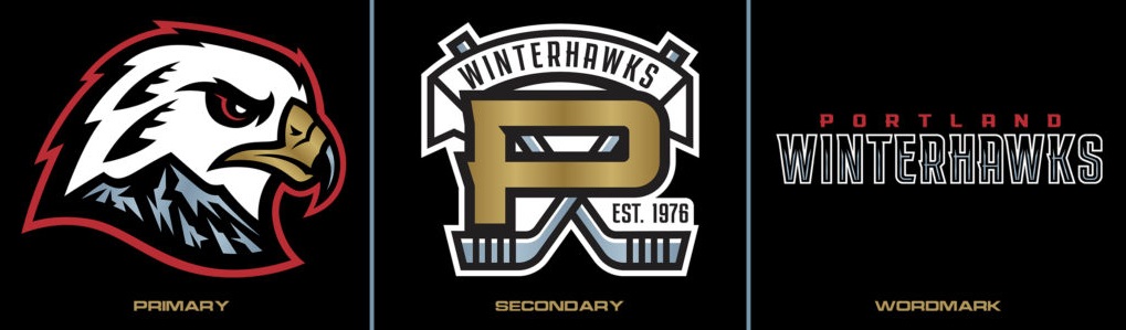
The Portland Winterhawks of the Western Hockey League, have revealed a new brand identity, including a new primary, secondary and wordmark logos, as well as a revised color scheme.
“We are so proud to finally have our own identity,†began Michael Kramer of Winterhawks Sports Group, owner and managing partner of the franchise. “We feel our new look is fresh and unique, one that we are excited about and believe our community will be as well.â€
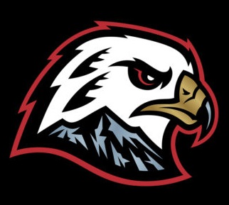
The club’s new primary logo, a right-facing hawk featured with a predominantly white head, also carries the tradition of former colors black and red. The new scheme adds “celly gold†and also squall gray, a color distinct to the new Winterhawks brand. The palette comes together on the bird to take place of an existing emblem that began representing the organization after being loaned in 1976.
Also featured on the bird head are two feathers, carrying the legacy of the franchise’s roots and serving as a subtle nod to the feathers in the previous logo. The bottom of the hawk’s head includes Mount Hood in the aforementioned new squall gray, an iconic mountain from the Cascade Range synonymous with the Portland area. Located within the Mount Hood figure are also the letters “W†and “Hâ€, for further characterization of Winterhawks. The previous logo was the same one used by the Chicago Blackhawks.
“Under a new ownership group led by Michael Kramer and Kerry Preete, the Portland Winterhawks are embarking on a new chapter in franchise history, so it is only fitting they do so with a new primary logo design that truly represents Portland, the Pacific Northwest and its great fanbase,†commented WHL Commissioner Ron Robison. “The Winterhawks have a long history of success in the Portland market and I am confident their passionate fans will embrace this fresh approach and unique design when the WHL Regular Season opens in October.â€

The new brand identity was created in collaboration with Portland Gear, a local Portland-based company and designed by Brian Gundell, a University of Oregon graduate that has created work for NHL, MLB, NFL, MLS, MiLB, Adidas and Under Armour.
“We are very excited to played a role in the creation of a new identity for one of the Portland’s four major sports teams,†Marcus Harvey, owner of Portland Gear remarked. “This project was many months in the making and we’re thrilled to finally be able to showcase it.â€
The refreshed color scheme can also be seen in the club’s new secondary logo, which features a revitalized edition of the “Portland P†that the team has utilized in the past. The logo will be worn on the team’s jerseys as a shoulder patch, with the P being in gold font at the forefront of two hockey sticks in squall gray. “Est. 1976†– a nod to the 45-year success of the franchise in The Rose City, one of the longest tenured in the WHL, is also included on the patch. “Winterhawks†can be seen hung in a banner atop the logo.
The team’s new identity goes into place effective immediately.
New Winterhawks brand gear is currently available for purchase at
ShopWinterhawks.com
 --Staff Reports
| Post Date: 2021-07-14 17:16:13 | Last Update: 2021-07-14 18:10:21 |